? Table of contents:
- The syntax of CSS media queries #
- Defining media types in CSS media queries #
- Media query modifiers (logical operators) #
- Common media features for CSS media queries #
- Less common media features for CSS media queries #
- Media features from CSS media queries level 5 #
- Non-standard media features #
- Best practices for CSS media queries #
Before I get to the different media features themselves, let’s cover the basic syntax for a CSS media query. A media query looks like this:
@media screen and (min-width: 900px) {
  article {
    padding: 1rem 3rem;
  }
}
Code language: CSS (css)
To help you break down each of the parts, here’s a handy image that identifies all the parts of a typical CSS media query:
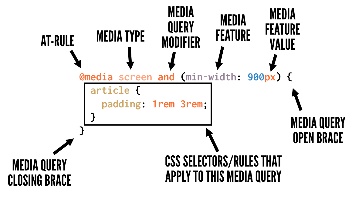
And here’s a summary along with further details on what’s in the image:
@media– The CSS at-rule that indicates that you’re writing a media queryscreen– One of the available media types to identify which devices should the media query should target. This is optional if you’re not using thenotandonlyoperators.and– A media query modifier, also called a logical operator, that helps you conditionally target certain devices and media features.(min-width: 900px)– One of numerous media features and values available to target specific device sizes, device types, device capabilities, etc.article { ... }– The selectors and CSS rules, nested inside opening and closing curly braces, indicating what CSS rules you want to apply to your media queries.
You can include as much CSS as you want inside the opening and closing media query curly braces, as long as the CSS is correctly formatted, so it doesn’t break (i.e., no missing curly braces for any selectors, etc).
As the previous section showed, you can optionally define what media types you want to target with your media query. The media types describe the category of device you want the styles to apply to. Media types are defined with one of three keywords:
all– Indicates that you want to target all devices, with no exceptions.print– Targets devices that send output to a print display like the “Print Preview” window in a web browser.screen– This is the opposite ofprint, targeting all devices that don’t fall under theprintcategory.
Above are the only media types you should use, if any. In the CSS media queries level 4 specification, numerous previously supported media types are now deprecated. The spec discourages use of these and browsers are instructed to ignore them while still viewing them as “valid” code (to ensure the code doesn’t break going forward). These media types include: tty, tv, projection, handheld, braille, embossed, aural, and speech.
And note that the specification also explains:
It is expected that all the media types will also be deprecated in time, as appropriate media features are defined which capture their important differences.
In other words, it’s expected that one day we’ll write all our media queries with no media types.
You may also be interested in:
Each media query also has access to two specific modifiers, or logical operators, that help you add conditional logic to your media queries.
A modifier is a single keyword that affects the meaning of the media feature that follows it. The available modifiers are:
The not modifier
When this modifier precedes a media feature, it excludes the targeted devices from the media query (similar to how CSS’s :not() selector works).
Here’s an example:
@media not print {
  article {
    padding: 1rem 3rem;
  }
}
Code language: CSS (css)
The above media query would target all devices that aren’t print devices, thus the above would be equivalent to using screen with no modifier.
The only modifier
This modifier is specifically for helping legacy browsers correctly parse a media query. As the spec explains: “The only keyword has no effect on the media query’s result, but will cause the media query to be parsed by legacy user agents as specifying the unknown media type “only,” and thus be ignored.”
Take a look at an example:
@media only screen {
  article {
    padding: 1rem 3rem;
  }
}
Code language: CSS (css)
The and modifier
Used to combine multiple media features in a single media query.
An example is as follows:
@media screen and (min-width: 800px) {
  article {
    padding: 1rem 3rem;
  }
}
Code language: CSS (css)
The above targets all non-print devices that have a width equal to or greater than 800px.
The , modifier
The comma allows you to include a list of media queries that works similar to a logical or operator.
Here’s an example:
@media screen and (min-width: 800px), print and (min-width: 1000px) {
  article {
    padding: 1rem 3rem;
  }
}
Code language: CSS (css)
The styles in the above media query will target either of the two media queries separated by the comma. This is similar to how the comma works when using CSS selectors.
Now we get to the meat of this guide on how to use CSS media queries — the different media features you can incorporate. These target devices that have specific characteristics as indicated by the chosen media features.
Media features improve on the use of media types, allowing you to use a more fine-grained approach to applying your styles in certain circumstances. In this section and the following sections, I’ll describe what each one targets, along with some example code to show each of the possible values or types of values.
This section looks at the most commonly used and best supported media features:
width: Width of the viewport including width of scrollbar. Also allows use of the min- and max- prefixes.
@media (width: 800px) { ... }
@media (min-width: 360px) { ... }
@media (max-width: 1400px) { ... }
Code language: CSS (css)height: The height of the viewport. Accepts min- and max- prefixes.
@media (height: 500px) { ... }
@media (min-height: 400px) { ... }
@media (max-height: 400px) { ... }
Code language: CSS (css)orientation: Orientation of the viewport.
@media (orientation: portrait) { ... }
@media (orientation: landscape) { ... }
Code language: CSS (css)display-mode: The display mode of the application, as specified in the web app manifest.
@media (display-mode: fullscreen) { ... }
@media (display-mode: standalone) { ... }
@media (display-mode: minimal-ui) { ... }
@media (display-mode: browser) { ... }
Code language: CSS (css)aspect-ratio: Based on the specified aspect ratio, indicated by two positive integers separted by a slash.
@media (aspect-ratio: 16/9) { ... }
Code language: CSS (css)color: Number of bits per color component of the output device, or zero if the device doesn’t use color. Also allows use of min- and max- prefixes. No value indicates you’re targeting any color device.
@media (color) { ... }
@media (color: 8) { ... }
@media (min-color: 8) { ... }
@media (max-color: 16) { ... }
Code language: CSS (css)grid: Detect if the device uses either a grid-based screen (e.g. a text-based terminal) or bitmap-based screen (like most modern computers, tablets, and smartphones). A value of 1 means grid-based, a value of 0 means bitmap-based.
@media (grid: 0) { ... }
@media (grid: 1) { ... }
Code language: CSS (css)monochrome: Bits per pixel in the device’s monochrome frame buffer.
@media (monochrome: 0) { ... }
@media (monochrome) { ... }
Code language: CSS (css)resolution: The pixel density of the output device. Can also use the min- and max- prefixes.
@media (resolution: 72dpi) { ... }
@media (min-resolution: 300dpi) { ... }
@media (max-resolution: 150dpi) { ... }
Code language: CSS (css)
The following media features are not as commonly used, but you may find them useful in specific circumstances. Some of these may also lack browser support, so be sure to look up support on caniuse.com or MDN before using any of them.
any-hover: Whether or not there is hover functionality present.
@media (any-hover: none) { ... }
@media (any-hover: hover) { ... }
Code language: CSS (css)any-pointer: Whether there is a pointing device present and how accurate it is.
@media (any-pointer: none) { ... }
@media (any-pointer: course) { ... }
@media (any-pointer: fine) { ... }
Code language: CSS (css)color-gamut: Approximate range of colors supported by the device.
@media (color-gamut: srgb) { ... }
@media (color-gamut: p3) { ... }
@media (color-gamut: rec2020) { ... }
Code language: CSS (css)color-index: Number of entries in the output device’s color lookup table. Also allows use of min- and max- prefixes. No value indicates you’re targeting any color index.
@media (color-index) { ... }
@media (min-color-index: 15000) { ... }
@media (max-color-index: 30000) { ... }
Code language: CSS (css)hover: If the user can hover over elements.
@media (hover: none) { ... }
@media (hover: hover) { ... }
Code language: CSS (css)overflow-block: How the device handles content that overflows along the block axis.
@media (overflow-block: none) { ... }
@media (overflow-block: scroll) { ... }
@media (overflow-block: optional-paged) { ... }
@media (overflow-block: paged) { ... }
Code language: CSS (css)overflow-inline: How the device handles content that overflows the viewport along the inline axis.
@media (overflow-inline: none) { ... }
@media (overflow-inline: scroll) { ... }
Code language: CSS (css)pointer: If there is a pointer present on the device.
@media (pointer: none) { ... }
@media (pointer: coarse) { ... }
@media (pointer: fine) { ... }
Code language: CSS (css)scan: If the device is interlaced (like some plasma TVs) or progressive (like most computer monitors).
@media (scan: interlace) { ... }
@media (scan: progressive) { ... }
Code language: CSS (css)update: That is, update frequency. How frequently the output device can modify the appearance of content.
@media (update: none) { ... }
@media (update: slow) { ... }
@media (update: fast) { ... }
Code language: CSS (css)
The following media features are new in the media queries level 5 specification. Only a few of these have browser support at the moment, but it’s good to know what’s on the horizon when you learn how to use CSS media queries.
dynamic-range: Combination of brightness, contrast ratio, and color depth supported by the device.
@media (dynamic-range: standard) { ... }
@media (dynamic-range: high) { ... }
Code language: CSS (css)forced-colors: Detect whether the device has enabled a user-selected restricted color palette, such as would be the case when Windows High Contrast mode is enabled.
@media (forced-color: none) { ... }
@media (forced-color: active) { ... }
Code language: CSS (css)horizontal-viewport-segments: The number of logical horizontal segments of the viewport.
@media (horizontal-viewport-segments: 3) { ... }
Code language: CSS (css)environment-blending: Query the characteristics of the user’s display.
@media (environment-blending: opaque) { ... }
@media (environment-blending: additive) { ... }
@media (environment-blending: subtractive) { ... }
Code language: CSS (css)inverted-colors: If the browser or OS is inverting colors.
@media (inverted-colors: none) { ... }
@media (inverted-colors: inverted) { ... }
Code language: CSS (css)nav-controls: Whether the browser is providing discoverable navigation controls.
@media (nav-controls: none) { ... }
@media (nav-controls: back) { ... }
Code language: CSS (css)prefers-contrast: If the user prefers an increase or decrease in contrast between adjacent colors.
@media (prefers-contrast: no-preference) { ... }
@media (prefers-contrast: more) { ... }
@media (prefers-contrast: less) { ... }
Code language: CSS (css)prefers-color-scheme: If the user prefers a light or dark color scheme.
@media (prefers-color-scheme: light) { ... }
@media (prefers-color-scheme: dark) { ... }
Code language: CSS (css)prefers-reduced-data: If the user prefers alternate content that uses less data.
@media (prefers-reduced-data: no-preference) { ... }
@media (prefers-reduced-data: reduce) { ... }
Code language: CSS (css)prefers-reduced-motion: If the user prefers less motion on the page.
@media (prefers-reduced-motion: no-preference) { ... }
@media (prefers-reduced-motion: reduce) { ... }
Code language: CSS (css)prefers-reduced-transparency: If the user has requested the system minimize the amount of transparent or translucent layer effects.
@media (prefers-reduced-transparency: no-preference) { ... }
@media (prefers-reduced-transparency: reduce) { ... }
Code language: CSS (css)scripting: If scripting (almost always JavaScript) is available.
@media (scripting: none) { ... }
@media (scripting: initial-only) { ... }
@media (scripting: enabled) { ... }
Code language: CSS (css)vertical-viewport-segments: The number of logical horizontal segments of the viewport.
@media (vertical-viewport-segments: 3) { ... }
Code language: CSS (css)video-color-gamut: The approximate range of colors supported by the browser and device.
@media (video-color-gamut: srgb) { ... }
@media (video-color-gamut: p3) { ... }
@media (video-color-gamut: rec2020) { ... }
Code language: CSS (css)video-dynamic-range: The approximate range of colors supported by the browser and device.
@media (video-dynamic-range: standard) { ... }
@media (video-codynamic-range: high) { ... }
Code language: CSS (css)
Finally, here are some non-standard media features that aren’t recommended for use but in some cases you might find useful for targeting specific types of devices (e.g., iOS tablets and phones):
-webkit-device-pixel-ratio: Alternative to the resolution media feature, defined with a number value.
@media (-webkit-device-pixel-ratio: 2) { ... }
Code language: CSS (css)webkit-animation: If the device supports vendor-prefixed animations.
@media (-webkit-animation: true) { ... }
@media (-webkit-animation: false) { ... }
Code language: CSS (css)webkit-transform-2d: If the device supports vendor-prefixed CSS 2D transforms.
@media (-webkit-transform-2d: true) { ... }
@media (-webkit-transform-2d: false) { ... }
Code language: CSS (css)webkit-transform-3d: If the device supports vendor-prefixed CSS 3D transforms.
@media (-webkit-transform-3d: true) { ... }
@media (-webkit-transform-3d: false) { ... }
Code language: CSS (css)webkit-transition: A deprecated feature that detects if the device supports vendor-prefixed transitions.
@media (-webkit-transition: true) { ... }
@media (-webkit-transition: false) { ... }
Code language: CSS (css)
As you can see, the range of media features used in CSS media queries has grown quite a bit since the responsive web design movement began. You can detect pretty much whatever you want and write CSS for each type of device’s capabilities.
I’ve covered a lot of raw code in this guide on how to use CSS media queries, but the code alone won’t make you an expert with media queries. Here are some general tips and suggestions for getting the most out of CSS media queries:
- ❌ Don’t write media queries for specific device sizes like iPad, iPhone, etc. Write media queries according to how your layouts ‘break’ at different points (hence the term “breakpoints”). This means you’re allowing the content to define the breakpoints.
- ? If possible, go with a mobile-first approach with your media queries where your non-media query CSS would apply to the smallest device, then add media queries for larger viewports as needed.
- ? Take advantage of CSS layout features like flexbox and CSS grid to naturally create layouts that are responsive without the need for media queries, if possible.
- ? Don’t ignore the possibility of using vertical media queries that check for the height of the viewport. This could help you avoid some layout pitfalls on smaller devices.
- ? Don’t get stuck on width and height alone. Use some of the other well-supported media features that can help with accessibility and overall UX of your layouts on different devices.
All the new media features introduced in the last few years have made the possibilities for writing CSS media queries exciting and powerful!
You should definitely take advantage of the best-supported media features. You can also start considering using many of the new media features and expect that one day media types will be a thing of the past.
If you have any questions about how to use CSS media queries in 2022, let us know in the comments section below.