Web design often sits parallel to graphic design. There are a lot of overlaps, but for the most part the two don’t follow each other in a linear way.
New developments in web design spur on design trends and vice versa. But it can be easy to convince yourself that graphic design trends aren’t relevant for web design purposes.
You already have an established design that works, or you aren’t in a creative industry. But with more choice than ever for audiences, utilizing good design and modern trends can be an easy way to help differentiate yourself from your competitors.
A lot of graphic design trends will be impractical to recreate in web design, but there are elements of graphic design trends that you can use to influence and inform your web design decisions.
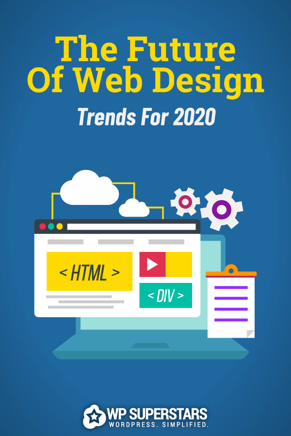
Trends in well-designed websites
When taking a look at the top graphic design trends for 2020, Venngage identified trends such as ‘muted colors’ and ‘natural looking stock photography’ that can be applied to web design at a small scale.
Changing a website color palette is a large overhaul for sure, but incorporating more muted elements into new landing pages or content can be a subtle nod to forward thinking trends without requiring a massive overhaul.
Good design can have a positive impact on your SEO as well, if done correctly. Beyond image optimization elements of design can lend themselves to SEO best practices. Obvious things like embracing minimalism and thinking about mobile first design can make a huge difference. But there are other ways that good design can benefit your SEO.
Ultimately, you want to create a visitor experience that is positive for your audience. You want people to find information quickly and easily, and provide ample opportunities for conversions (whatever that may look like for you). Outside of backlink building and keyword optimization design is another element you can easily influence.
Creating attractive but practical landing pages will enhance the user experience, leading to longer time on page and more shares. Picking up on design trends like ‘muted color palette’ can help draw visitors in and keep them for longer, because the page that they’re browsing is pleasant on the eyes.
Creating a well-designed web page can also help paint you as a best-in-class website. As trends become more mainstream, writers everywhere (like me!) will be looking for real life examples that best illustrate use of the trends.
And whilst becoming a thought leader might not be your ultimate goal, it’s absolutely worth keeping in mind the opportunities if you’re looking to grow or scale your site.
4 top web design trends to think about in 2020
Using design trends in your web design can be hugely beneficial for your users and your reputation. However there are draw backs to following trends. Some of the trends might not necessarily sit within your brand identity, and using them can feel like a step away from why your visitors love you.
Some trends work well in a graphic way but when taken in the context of a website can add extra steps to your user journey, or complicate and confuse the core purpose of your page.
Abstract illustrations are going to be huge in 2020, but this is a trend that should be left to marketing and advertising. These abstract illustrations make great content for sure, but the uses outside of content are very limited.
Below are the top four trends that you need to be thinking about in your web design in 2020:
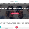
Trend 1: Minimalism
Minimalism is a web designers dream. Lots of clean blank space is both pleasing for the eye and Google. The less stuff on the page, the quicker the load time. The less stuff on the page, the easier the CTA is to locate.
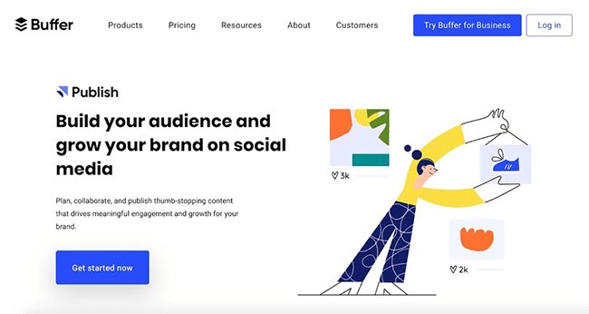
Tech companies have been using minimalistic landing pages for a while now, with giants like Hootsuite and Buffer taking the less is more approach. The use of blank space is punctuated with bold and colorful images and text stopping the page from becoming boring.
Think of blank space as breathing room. On sales based landing pages in particular, it’s easy to want to overwhelm your visitor with information about why your product is the best. Adding in this breathing room allows your visitor to process information without becoming overloaded.
An overly busy and complicated web page with hundreds of pop ups is infuriating, with most of us quickly scanning a page in order to identify if it’ll be of use to us. Help readers find what they’re looking for by using blank space.
The use of blank space is also great for your SEO and it helps increase the page load speed. And if users can quickly and easily find the information they were after, they’re less likely to bounce from frustration.
Lastly, using blank space and minimalism in your webpages can be a great way to highlight important information. Lots of blank space means that CTAs stand out more, or you can stress important points as titles or lists.
This trend is fairly easy to action for both new and existing pages. Space out blocks of text and images more, and leave room in between one section and the next. Blank space doesn’t have to be white space, but it should feel neutral.
Leave lots of wide borders around your sections. Try to make it so no block touches another block. An easy way to check that you’re achieving this trend is to load your webpage and take a few steps back from your screen.
Look for:
- How does it look from a distance?
- Does it look busy?
- Is there room in between sections?
- Do the relevant sections stand out?
Minimalism is one of the easiest trends you can bring to your webpages in 2020.
Trend 2: Strong CTAs
In 2020 CTAs will become more prominent than ever. As Google continues to prioritize no click searches, it’s becoming more and more important to convert users quicker. It’s not all doom and gloom though – there’s a strong chance that people who do click through to your page have a strong intent to convert.
One way you can make your CTAs super effective is to consider the user intent behind the search. That is: why did people click on your page specifically? What information are they in search off, and how can you show it to them?
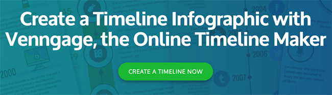
The CTA that convert the best are ones that are focused on audience intent. If people are searching for ‘timeline infographic templates’ having a CTA of ‘create a timeline now’ is exactly what the audience are looking for. Direct and actionable language is best for a strong CTA.
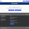
The trend for strong CTAs works brilliantly with the increase of minimalism in landing pages. With lots of blank space, it’s easy to make a button stand out by using a contrasting color. Design wise, a brightly colored box has been the standard for a few years now, but there’s still room to explore other design trends within this.
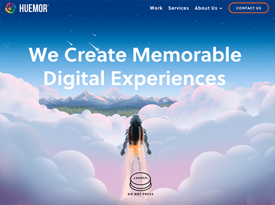
Making use of interesting fonts, different color palettes, or even illustrated CTAs can be really effective, and help give your web pages a modern and fresh look. In the above example, Huemor uses the lure of a big button to users to press.
If you want to think about refreshing your CTAs you can start by taking a look at your existing web design. What graphic elements do you use in order areas that could be repeated in your CTAs? Look at your blog headers, color palettes, fonts, icon usage, menu style etc. to identify any elements that could be adapted.
Much like the minimalism trend, you can check the effectiveness of your CTAs by taking a few steps back from the screen and seeing if they stand out.
Do your CTAs…
- Grab attention?
- Work with the flow of your page?
- Stand out on the page?
- Answer search intent?
Even if you don’t want to completely redesign your CTA style, you can start by thinking about search intent and update the text and positioning.
Trend 3: Cross-platform content
Just like Kevin in the office said: “Why waste time saying a lot of words when a few will do the trick?” Your content is a lot like this in that there’s no point making lots of new content when you could easily repurpose the content you already have.
Creating content for single use is mostly a waste of time and resources. Everything you create should be made in a way that it has multiple uses. Focus on quality over quantity in 2020.
You should take a ‘multi use’ approach to everything from blog posts, to branding and graphics, to layouts and designs. Not only does it help build brand consistency, it saves a lot of time too.
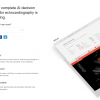
Making cross platform content doesn’t have to be difficult but it all comes down to the planning. Venngage wrote an e-book about repurposing your content which is available for free download here, but the basics are:
- Create descriptive visuals, such as infographics, that can be shared across multiple platforms.
- Make self-explanatory content that can be shared with minimal context to maximize repurposing opportunities. Quotes and stats work great for this.
- Map out the repurposing opportunities in the planning stage.
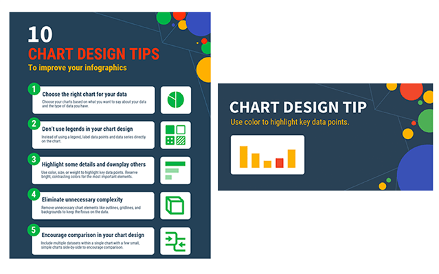
Here is an example from the e-book about how we turned one infographic into ten separate social media posts, by turning each ‘point’ into its own separate content.
A typical content plan for us would look like:
- Write a blog post
- Create an infographic for that blog post
- Share the infographic on social media
- Create a video out of the blog post content
- Share the video on social media
So even before we start writing, we’re aware of what assets we’ll be creating.
Illustrations and interestingly designed visuals are cross platform content gold. A set of illustrations can be used in a blog post, on a landing page, and on social media.
Cross platform content is absolutely one of the trends that should be on your radar in 2020, if it’s not already. And if you’re already repurposing your content and optimizing your old blog posts, take it to the next level by thinking strategically and planning all of the content executions first.
Trend 4: Branded animations
Branded animations have been popping up in the form of GIFs for a while now, but in 2020 branded animations are going to become a stable of digital marketing. As more companies adopt an approachable, casual online presence, seeing a reaction GIF from a brand is the norm now.
But with the over saturation of reaction GIFs, in order to stand out companies will need to start creating their own branded animations. Branded GIFs will have a much bigger impact on your audience than a standard reaction GIF or static image.
Though we’ve started to see these pop up on social media, brands are moving towards including branded animations in email newsletters, landing pages, and more. You can use animations to draw attention to key information, to create excitement, or to make a company seem more relatable and approachable.
Branded animations also help with brand recognition. Having a set of animations you can use in various situations that are distinctly ‘you’ is a great way to cement your brand identity on a mass scale. Especially if you’re trying to differentiate yourself from competitors by being less corporate or formal.
Well created animations can be used to convey a mood or tell a story. A full story might not always be necessary but it’s one way to ensure you keep your readers captive.
You can use this trend by creating short animations to share online. Think about the overall impact of the animation inclusion, and make sure to only use it on pages that will benefit from the impact an animation will bring.
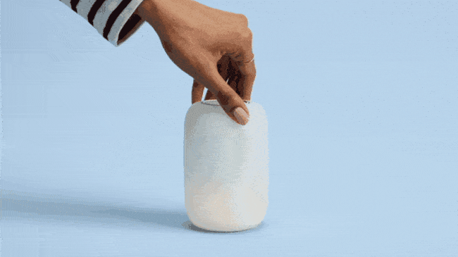
This GIF from Casper is a sweet and subtle addition to a landing page that really helps convey the brands personality:
Embedding GIFs can slow a page load speed significantly, so take that into account when using this trend.
If in doubt, A/B test your GIF pages to see what effect adding GIFs has to your audience retention, page load speed, and conversions.
Conclusion
Graphic design trends do intersect with web design trends in various ways, especially if you start to dig below the surface.
Having good design can really help you stand out against your competitors and provide a much more pleasant experience for your audience.
In 2020 make sure that you’re using the following trends to your full advantage:
- Minimalism
- Strong CTAs
- Cross platform content
- Branded animations