
If you have an information-rich website or application, you might want to visualize your data so that users can better make sense of it. Although tables can be quite useful in certain cases such as pricing and feature comparison tables, other kind of information is easier to process with the help of some kind of data visualization. JavaScript libraries such as Chart.js let you generate different types of HTML5 charts such as line, bar, pie, doughnut, and area charts.
Chart.js is a versatile library that let you create JavaScript charts in a couple of minutes. It has many options with which you can configure all aspects of your charts. In this tutorial, we will look into how to set up the Chart.js library, what your options are, and what you can achieve with it. We will also create two charts: a bar chart showing life expectancy in six countries and a doughnut/pie chart showing the recommended daily diet.

Add Chart.js to Your HTML Page
You can install Chart.js in different ways. If you want to store the entire library locally, you can install it with the npm package manager using the following command:
npm install chart.js --save
When the module is installed, add the minified version to the bottom of your HTML page, before the closing </body> tag in the following way:
<body>
     <!-- HTML content -->
     <script src="https://www.developerdrive.com/node_modules/chart.js/dist/Chart.bundle.min.js"></script>
     <script src="script.js"></script>
</body>
Your custom script will go into the script.js file. Alternatively, you can also add the scripts to your page using module loaders such as CommonJS or Webpack.
If you don’t want to store the Chart.js library locally, you can add it from CDN using the following code:
<body>
     <!-- HTML content -->
     <script src="https://cdnjs.cloudflare.com/ajax/libs/Chart.js/2.8.0/Chart.bundle.min.js"></script>
     <script src="script.js"></script>
</body>
Or, you can clone the latest version of Chart.js right from the GitHub repo. However, note that the GitHub repo doesn’t come with a pre-built release version, so you need to build the library into a single file by yourself.
Set Up the HTML
With Chart.js, you can add JavaScript charts to your HTML page using the <canvas> element. In your HTML file, add the following code inside the <body> tag (above the <script> tags):
<div class="container">
     <canvas id="myChart" width="600" height="400"></canvas>
</div>
Chart.js will place your chart inside the <canvas> element. Although the chart will be created with JavaScript, it will appear on your page as a PNG image file.
Now, you need to add your custom configuration to the script.js file. Below, we will show you how to create two kinds of charts: a vertical bar chart and a full-circle doughnut (or pie) chart. However, you can use the same logic with any other chart types. In the Chart.js docs, you can check out all the chart types you have access to.
Create a Bar Chart with JavaScript
Our bar chart will display the life expectancy by country dataset from the World Population Review. It will show six countries with the highest life expectancy, as follows:
| Country | Life expectancy (years) |
| Hong Kong | 84.308 |
| Macau | 84.188 |
| Japan | 84.118 |
| Switzerland | 83.706 |
| Spain | 83.5 |
| Singapore | 83.468 |
We will create a vertical bar chart with interactive tooltips that will show the exact data when the user hovers the bars. However, note that it’s also possible to create a horizontal bar chart with Chart.js. On the gif demo below, you can see how our chart will look like:
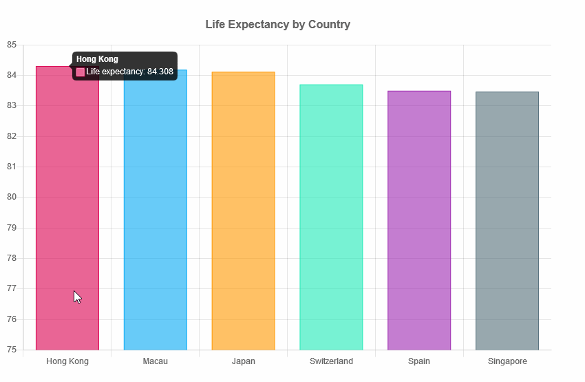
Chart.js requires two variables: one that captures the HTML element (ctx in the example below) and one that holds the custom Chart object (myChart below). We need to add the names of the countries as the value of the labels property. And, we define the data (life expectancy in years) as the value of the data property of the datasets array.
The following code goes into the custom script.js file:
// Vertical bar chart
var ctx = document.getElementById('myChart').getContext('2d');
var myChart = new Chart(ctx, {
    type: 'bar',
    data: {
        labels: ['Hong Kong', 'Macau', 'Japan', 'Switzerland', 'Spain', 'Singapore'],
        datasets: [{
            label: 'Life expectancy',
            data: [84.308, 84.188, 84.118, 83.706, 83.5, 83.468],
            backgroundColor: [
                'rgba(216, 27, 96, 0.6)',
                'rgba(3, 169, 244, 0.6)',
                'rgba(255, 152, 0, 0.6)',
                'rgba(29, 233, 182, 0.6)',
                'rgba(156, 39, 176, 0.6)',
                'rgba(84, 110, 122, 0.6)'
            ],
            borderColor: [
                'rgba(216, 27, 96, 1)',
                'rgba(3, 169, 244, 1)',
                'rgba(255, 152, 0, 1)',
                'rgba(29, 233, 182, 1)',
                'rgba(156, 39, 176, 1)',
                'rgba(84, 110, 122, 1)'
            ],
            borderWidth: 1
        }]
    },
    options: {
        legend: {
            display: false
        },
        title: {
            display: true,
            text: 'Life Expectancy by Country',
            position: 'top',
            fontSize: 16,
            padding: 20
        },
        scales: {
            yAxes: [{
                ticks: {
                    min: 75
                }
            }]
        }
    }
});
The documentation of Chart.js is really good, so you can find all the options we have used above (backgroundColor, borderColor, borderWidth, etc.) on the Bar page.
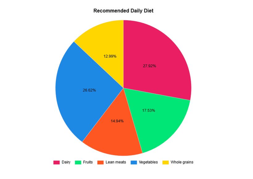
Create a Doughnut Chart with JavaScript
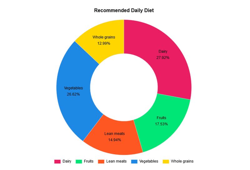
Now, let’s create a doughnut chart with the Chart.js library. It will show the distribution of the recommended daily diet according to the following StatCrunch dataset:
| Dairy | 27.92% |
| Fruits | 17.53% |
| Lean meats | 14.94% |
| Vegetables | 26.62% |
| Whole grains | 12.99% |
Here, we don’t want to show an interactive tooltip but display the data labels and values on top of the chart in the following way:
Install the Data Labels Plugin
As Chart.js doesn’t have an option for displaying labels on top of the charts, we need to use the Chart.js Data Labels plugin. Chart.js allows developers to extend the default functionality by creating plugins. Currently, there are five Chart.js plugins available on GitHub for the following functionalities:
- data labels (we will use this one),
- zoom,
- annotation,
- financial charting,
- deferring initial chart updates.
The Chart.js Data Labels plugin has a pretty good documentation; you can find everything you might need. You can either install it with the npm package manager using the command below or add the latest version of the library from CDN.
npm install chartjs-plugin-datalabels --save
Add the Custom JavaScript
The JavaScript uses the same <canvas> element as before, or, if you want to keep both charts, you can add a new canvas to the HTML with a different ID:
<div class="container">
     <canvas id="myChart" width="600" height="400"></canvas>
</div>
In the JavaScript, we now define the chart type as doughnut. The rest of the code follows the same logic as before. We add the data as values of the labels and dataset properties of the data object.
// Doughnut chart
var ctx = document.getElementById('myChart').getContext('2d');
var myChart = new Chart(ctx, {
    type: 'doughnut',
    data: {
        labels: ['Dairy', 'Fruits', 'Lean meats', 'Vegetables', 'Whole grains'],
        datasets: [{
            data: [27.92, 17.53, 14.94, 26.62, 12.99],
            backgroundColor: ['#e91e63', '#00e676', '#ff5722', '#1e88e5', '#ffd600'],
            borderWidth: 0.5 ,
            borderColor: '#ddd'
        }]
    },
    options: {
        title: {
            display: true,
            text: 'Recommended Daily Diet',
            position: 'top',
            fontSize: 16,
            fontColor: '#111',
            padding: 20
        },
        legend: {
            display: true,
            position: 'bottom',
            labels: {
                boxWidth: 20,
                fontColor: '#111',
                padding: 15
            }
        },
        tooltips: {
            enabled: false
        },
        plugins: {
            datalabels: {
                color: '#111',
                textAlign: 'center',
                font: {
                    lineHeight: 1.6
                },
                formatter: function(value, ctx) {
                    return ctx.chart.data.labels[ctx.dataIndex] + 'n' + value + '%';
                }
            }
        }
    }
});
As you can see above, we have added the settings of the Data Labels plugins to the options.plugin property of the doughnut chart. The formatter() method places the data labels (e.g. “Whole grains 12.99%”) on top of our chart.
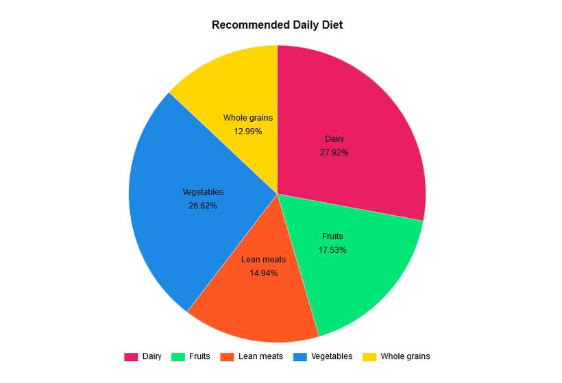
Create a Pie Chart of the Same Data Set
As Chart.js is a really versatile plugin, you can easily turn the above dataset into a pie chart. Doughnut and pie charts are both for the presentation of data distribution, so they come with the same settings. The only thing you have to change in the code is the type of the chart:
// Pie chart
var myChart = new Chart(ctx, {
    type: 'pie',

    /* rest of the code stays the same */
});
This is the same dataset presented as a pie chart:
You can also opt for showing only the percentages by editing the formatter() method as follows:
formatter: function(value) {
      return value + '%';
}
Create Other Types of Charts
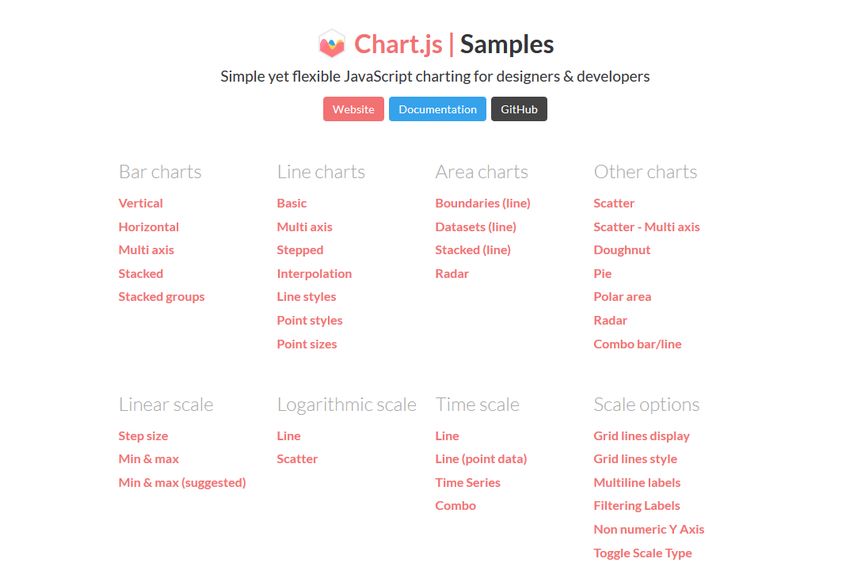
With Chart.js, you can create many other chart types as well such as line, radar, polar area, bubble, scatter, area, and mixed charts. The documentation also has a Samples page where you can find live examples of all chart types.
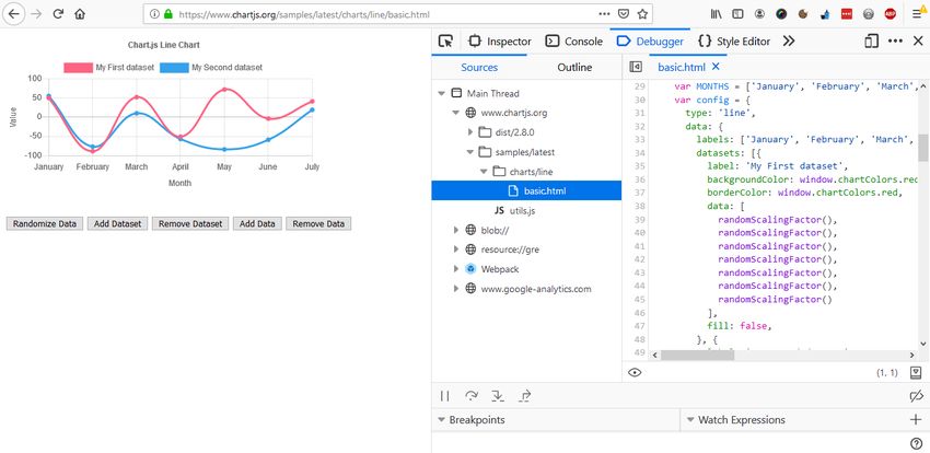
Although you can’t directly grab the JavaScript code of the samples, you can access it using your browser’s developer tools (in most browsers you need to hit the F12 key). Note, however, that the live samples use different variables from what we have used in the article (which is recommended by the official docs), so you need to tinker a bit with the code:
Wrapping Up
Adding data visualizations to your HTML page can help users understand your content. This can be especially useful on educational websites, admin dashboards, and landing pages.
In this tutorial, we have showed you how to create different kinds of charts, namely bar, doughnut, and pie charts, using the Chart.js library. If you want to learn more about data visualization, take a look at our article about how to create a data table in Vue.js, too.