
Before the flexbox layout module was introduced, it had been a challenge to create the holy grail layout. We had to use all kinds of tweaks to achieve this kind of layout loved both by marketers and website owners, as it allows us to use two sidebars at the same time — one on the left and one on the right side. Thanks to flexbox, now we can build it in just a few lines of code.
So, in this tutorial, we will look into how to create the holy grail layout with flexbox — in two different ways. First, we will use one huge flex container for all the items. Second, we will use two smaller flex containers that will separate horizontal and vertical items in code.
We will also use a mobile-first approach, which means that the default layout will be the mobile layout and the desktop layout will be added with a min-width media query.
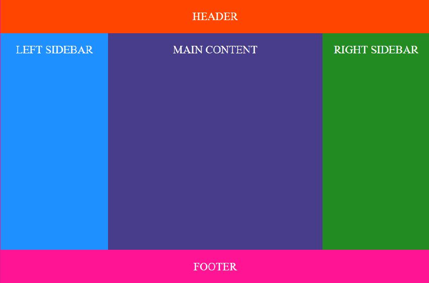
Our holy grail layout will look like as follows in full size:
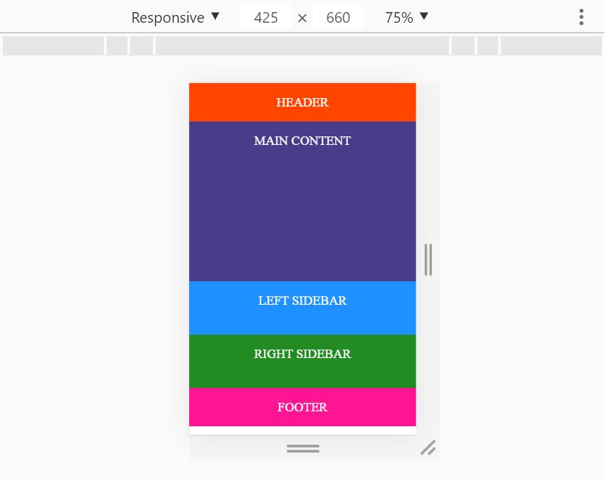
And, this is how it will look like on mobile devices (remember that this is the default layout we will create first):
Why Create the Holy Grail Layout with Flexbox?
Although it’s also possible to create the holy grail layout with CSS Grid, flexbox does have some advantages over it. Most importantly, it lets us create content-aware sidebars. This is because when flexbox allocates space for flex items, it takes into account the width of their internal content. As a result, we can distribute the available space proportionally between the main area and the sidebar with the help of the flex property.
We will also make use of the order property to change the order of the items based on the viewport size. So, on mobile devices, the main area will be on top of the screen right below the header, while on large screens, the left sidebar will come before the main area.
1. Holy Grail Layout Using One Level of Flex Items
Create two empty text files for the demo: one for the HTML (e.g. index.html) and one for the CSS (e.g. style.css).
1.1. Set up the HTML
The first technique uses a flat HTML structure. The .container element will be the flex container and it will hold 5 flex items:
- header
- main
- .left-sidebar
- .right-sidebar
- footer
In the HTML file, place the main area before the two sidebars. This is primarily because we follow the mobile-first principle and want to display the main content first for mobile users. However, this source order also improves accessibility, as screen readers will also read the main content before the sidebars.
<div class="container">
        <header>HEADER</header>
        <main>MAIN CONTENT</main>
        <aside class="left-sidebar">LEFT SIDEBAR</aside>
        <aside class="right-sidebar">RIGHT SIDEBAR</aside>
        <footer>FOOTER</footer>
</div>
1.2. Start with Basic Styling
Open your CSS file in a code editor and add some reset and basic styling rules. The ones below are really simple ones. They remove some of the browser’s default styles and add coloring and alignment to the flex items.
/* RESET */
* {
    box-sizing: border-box;
    padding: 0;
    margin: 0;
}
/* COLORS and FONTS */
body {
    color: white;
    text-align: center;
    font-size: 24px;
    line-height: 3;
}
header {
    background: orangered;
}
main {
    background: darkslateblue;
}
footer {
    background: deeppink;
}
.left-sidebar {
    background: dodgerblue;
}
.right-sidebar {
    background: forestgreen;
}
1.3. Add the Flexbox Rules for Mobile Size
For mobile, the holy grail layout is really simple — it just takes two CSS rules. First, we set the display property to flex. Second, we lay out the flex items vertically below each other, using the flex-direction: column; rule.
.container {
    display: flex;
    flex-direction: column;
}
1.4. Add the Flexbox Rules for Desktop Size
For desktop size, we use a min-width media query. First and foremost, we change the flex-direction to row, as now the main area and the two sidebars will be displayed next to each other. We also set flex-wrap to wrap so that the flex items can nicely wrap along the main axis of the flex container.
We also set the width of the header and footer elements to 100%, as they are supposed to run across the entire screen. Besides, we use the min-height: 80vh; rule on the main section so that the demo will have a default height without any content.
@media all and (min-width: 768px) {
    .container {
        flex-direction: row;
        flex-wrap: wrap;
    }
    header,
    footer {
        width: 100%;
    }
    main {
        flex: 2;
        order: 2;
        min-height: 80vh;
    }

    .left-sidebar {
        order: 1;
        flex: 1;
    }
    .right-sidebar {
        flex: 1;
        order: 3;
    }
    footer {
        order: 4;
    }
}
We also reorder the items using the order property. In this way, the left sidebar will come before the main area for desktop users. The default value of order is 0 for each item. So, we don’t need to change it for the first element (header), as it needs to remain 0. However, we assign a custom order value to all the other items, from 1 to 4.
The flex property defines how the available space is allocated between flex items. As the header and footer elements have a fixed width (100% of the screen), the remaining space is allocated only between the main area and the two sidebars in 2:1:1 proportion.
2. Holy Grail Layout Using Two Levels of Flex Items
2.1. Set up the HTML
The second technique places the main area and the two sidebars into the .content element so that we can treat them separately. As a result, we will have two flex containers. The outer flex container will be the .container element that will have 3 flex items:
- header
- .content
- footer
The .content element will be the inner flex container. It will also include 3 flex items:
- main
- .left-sidebar
- .right-sidebar
<div class="container">
        <header>HEADER</header>
        <div class="content">
             <main>MAIN CONTENT</main>
             <aside class="left-sidebar">LEFT SIDEBAR</aside>
             <aside class="right-sidebar">RIGHT SIDEBAR</aside>
        </div>
        <footer>FOOTER</footer>
    </div>
2.2. Start with Basic Styling
The basic CSS styles are the same as in the previous example:
/* RESET */
* {
    box-sizing: border-box;
    padding: 0;
    margin: 0;
}
/* COLORS and FONTS */
body {
    color: white;
    text-align: center;
    font-size: 24px;
    line-height: 3;
}
header {
    background: orangered;
}
main {
    background: darkslateblue;
}
footer {
    background: deeppink;
}
.left-sidebar {
    background: dodgerblue;
}
.right-sidebar {
    background: forestgreen;
}
2.3. Add the Flexbox Rules for Mobile Size
The flexbox rules for small screens are also the same as before, however, now we add them to both flex containers. As a result, all the content items will be nicely displayed below each other on mobile devices.
.container,
.content {
    display: flex;
    flex-direction: column;
}
2.4. Add the Flexbox Rules for Desktop Size
We use the same logic for desktop size, too. However, now, we only change the direction of the inner flex container (.content) to row. In this way, the header, .content, and footer elements will be displayed as a column, while the main, .left-sidebar, and .right-sidebar elements will be displayed as a row within the middle column (.content).
The flex rules use the same 2:1:1 proportion as in the case of the previous technique. We also define the order of the inner flex items by setting the order property of the left sidebar to 1, the main content to 2, and the right-sidebar to 3.
@media all and (min-width: 768px) {
    .content {
        flex-direction: row;
        flex-wrap: wrap;
    }
    main {
        flex: 2;
        order: 2;
        min-height: 80vh;
    }
    .left-sidebar {
        order: 1;
        flex: 1;
    }
    .right-sidebar {
        flex: 1;
        order: 3;
    }
}
Wrapping Up
In this article, we have shown you two techniques to create the holy grail layout with flexbox — both techniques leading to the same result. As neither is superior to the other one, you can use the one you like more or better fits with the rest of your code. If you want to see how the holy grail layout looks like in real life, you can check out the live demos for the one-level and two-level techniques, too.
If you are interested in reading more step-by-step CSS tutorials, have a look at our previous articles about how to create a collapsing header effect and the dark mode version of your site as well.
