Bootstrap 4 is currently the most popular front-end framework in the world. You can use it to build any kind of user interfaces, from admin templates to full-featured websites. In this step-by-step tutorial, we will have a look at how to build a responsive landing page with Bootstrap 4. You can even use it as a homepage or connect it to a specific marketing campaign.
The landing page we will build will have five sections:
- a fixed navigation bar,
- a hero section,
- a three-column “Services” section,
- a full-width “Contact” section, and
- a footer.
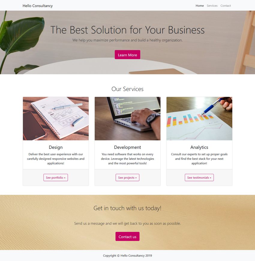
However, following the same logic, you can create other sections for testimonials, blog excerpts, and other content types, too. Here’s how the final landing page will look like:
So, let’s get started.
1. Set Up Bootstrap 4
There are a couple of ways of getting started with Bootstrap 4. You can:
- download the compiled CSS and JavaScript and add it to your HTML page,
- set up Bootstrap 4 using your own pipeline (choose this if you want to edit Sass files),
- use the CDN version of the compiled CSS and JavaScript.
In our example, we will use the first method. Add the minified CSS file to the <head> section of your HTML page and the JavaScript file right before the closing <body> tag. As all Bootstrap 4 plugins depend on jQuery, you also need to include jQuery before the minified Bootstrap script.
Here’s the starter HTML with the compiled CSS and JavaScript files and style.css file for the custom CSS:
<!DOCTYPE html>
<html lang="en">
   <head>
      <meta charset="utf-8">
      <meta name="viewport" content="width=device-width, initial-scale=1">
      <title>Bootstrap Landing Page by Developer Drive</title>

      <link href="css/bootstrap.min.css" rel="stylesheet">
      <link href="css/style.css" rel="stylesheet">

   </head>

   <body>

       <!-- Here comes the rest of the code -->

       <script src="https://www.developerdrive.com/scripts/jquery.min.js"></script>
       <script src="scripts/bootstrap.bundle.min.js"></script>
   </body>
</html>
2. Create the Navigation Bar
Bootstrap 4 comes with an awesome pre-designed navigation bar component that lets you add a responsive menu to your landing page with just a few lines of HTML. Insert the following code into the <body> section of your HTML file:
<nav class="navbar navbar-expand-lg navbar-light bg-light fixed-top">
    <div class="container">
        <a class="navbar-brand" href="#">Hello Consultancy</a>
        <button class="navbar-toggler" type="button" data-toggle="collapse"
        data-target="#navbarSupportedContent" aria-controls="navbarSupportedContent"
        aria-expanded="false" aria-label="Toggle navigation">
            <span class="navbar-toggler-icon"></span>
        </button>

        <div class="collapse navbar-collapse" id="navbarSupportedContent">
            <ul class="navbar-nav ml-auto">
                <li class="nav-item active">
                    <a class="nav-link" href="#">Home
                        <span class="sr-only">(current)</span>
                    </a>
                </li>
                <li class="nav-item">
                    <a class="nav-link" href="#services">Services</a>
                </li>
                <li class="nav-item">
                    <a class="nav-link" href="#contact">Contact</a>
                </li>
            </ul>
        </div>
    </div>
</nav>
The most important thing to know about Bootstrap 4 is that it has a utility class for almost everything. For instance, they have .bg-light (see above) that adds a light background and .bg-dark that adds a dark background to any HTML element. With Bootstrap 4, you can prototype your designs by barely touching any CSS code.
However, as the .fixed-top class fixes the navigation bar to the top, you need to make some extra space for it. So, add the following rule to your custom style.css file. Or, if you don’t want a fixed navigation bar, simply omit the .fixed-top class from your HTML code.
body {
    padding-top: 56px;
}
3. Compose the Hero Section
Hero sections are an integral part of most landing pages. They usually include a full-width background image, a headline, a short description, and a call-to-action button. Fortunately, Bootstrap 4 has a pre-designed component called Jumbotron that allows you to easily add a hero section to your page. You need to add the .jumbotron class to the element that will hold the hero section:
<header class="jumbotron jumbotron-fluid">
    <div class="container-fluid text-center">
       <h1 class="display-3">The Best Solution for Your Business</h1>
       <p class="lead pb-4">We help you maximize performance and build a healthy organization.</p>
       <p><a href="#" class="btn btn-primary btn-lg" role="button">Learn More</a></p>
    </div>
</header>
If you want a full-width hero section, use the .container-fluid and .jumbotron-fluid classes. If you don’t want it to span the whole viewport, use .container and .jumbotron instead (see detailed explanation in the Jumbotron docs).
The code above also makes use of Bootstrap 4’s .display-3 and .lead typography classes and the .text-center text alignment class. Besides, it adds bottom padding to the lead text by using the .pb-4 class. If you want to use other margin and padding sizes check out how Bootstrap 4’s spacing classes work. For instance, the .pb-4 class adds the padding-bottom: 1.5rem !important; rule to any HTML element.
You also need to add a background image to the Jumbotron section in your custom style.css file. If you want you can override the background color of primary buttons, too:
.jumbotron {
    background: url("image.jpg") no-repeat center;
}
.btn-primary {
    background-color: #c60063;
    border-color: #c60063;
}
Here’s how our example landing page looks like so far, with the navigation bar and the hero section:

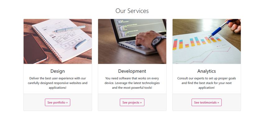
4. Create a Three-Column Section to Showcase Services
To create a three-column Services section, use Bootstrap 4’s responsive grid system consisting of rows and columns that divide up the screen. By default, every row contains 12 columns (however, you can change this in your Sass settings). You can indicate the number of columns you want to use within the name of the column class. For example, .col-4 takes up 4 columns out of the 12.
Bootstrap 4 has five responsive breakpoints that define five grids: extra small (default), small, medium, large, and extra large. As the breakpoints are based on minimum width media queries, the column classes apply to their own grid and all the grids above.
For instance, in the code below, .col-md-4 applies to the medium, large, and extra large grids. This means that tablets and desktops will display the Services section in 3 equal columns next to each other. And, smartphones with extra small and small viewports will display them below each other (one column per row).
<section id="services" class="container">
<h2 class="display-4 text-center mt-5 mb-3">Our Services</h2>
<div class="row text-center">
<div class="col-md-4 mb-4">
<div class="card h-100">
<img class="card-img-top" src="https://www.developerdrive.com/design.jpg" alt="Design">
<div class="card-body">
<h4 class="card-title">Design</h4>
<p class="card-text">Deliver the best user experience
with our carefully designed responsive websites and applications!</p>
</div>
<div class="card-footer py-4">
<a href="#" class="btn btn-secondary">See portfolio »</a>
</div>
</div>
</div>
<div class="col-md-4 mb-4">
<div class="card h-100">
<img class="card-img-top" src="development.jpg" alt="Development">
<div class="card-body">
<h4 class="card-title">Development</h4>
<p class="card-text">You need software that works on every device.
Leverage the latest technologies and the most powerful tools!</p>
</div>
<div class="card-footer py-4">
<a href="#" class="btn btn-secondary">See projects »</a>
</div>
</div>
</div>
<div class="col-md-4 mb-4">
<div class="card h-100">
<img class="card-img-top" src="analytics.jpg" alt="Analytics">
<div class="card-body">
<h4 class="card-title">Analytics</h4>
<p class="card-text">Consult our experts to set up proper goals and
find the best stack for your next application!</p>
</div>
<div class="card-footer py-4">
<a href="#" class="btn btn-secondary">See testimonials »</a>
</div>
</div>
</div>
</div>
</section>
The code above also makes use of Bootstrap 4’s Card component that comes with five pre-built classes: .card, .card-img-top, .card-body, .card-title, and .card-text. The .h-100 class is one of Bootstrap 4’s sizing utility classes you can use on any element you want. It sets the height of each card to 100%.
You can also override the design of secondary buttons in your style.css file to match it with the rest of your landing page, for example:
.btn-secondary {
    background-color: transparent;
    border-color: #c60063;
    color: #c60063;
}
Here is how the three-column Services section looks like on desktop (on mobile, the three cards will be under each other):
5. Add a Full-Width Contact Section
You can add a full-width Contact section to your landing page using Bootstrap 4’s utility classes:
<section class="container-fluid text-center py-4 mt-4" id="contact">
   <h2 class="display-4 pb-4 my-4">Get in touch with us today!</h2>
   <p class="lead pb-3">Send us a message and we will get back to
   you as soon as possible.</p>
   <a href="#" class="btn btn-primary btn-lg mb-4" role="button">Contact us</a>
</section>
Similar to the Jumbotron section, you also need to add a background image to the Contact section in your style.css file:
#contact {
    background: url("contact.jpg") no-repeat center;
}
Here’s how the Contact section looks like:

6. Create the Footer
Landing pages usually have simple footers, so the code below simply adds a copyright notice to the bottom of the page:
<footer class="py-3 bg-light">
<div class="container">
<p class="text-center">Copyright © Hello Consultancy 2019</p>
</div>
</footer>
And, we are done! Here’s again how the entire landing page created with Bootstrap 4 looks like:
Wrapping Up
In this article, we have created a fairly simple landing page. In the real world, it would have other sections as well, such as key features, pricing tables, client logos, and testimonials. Using Bootstrap 4’s responsive grid system, you can easily create other column-based sections as well, similar to the Services section.
Bootstrap 4 also has multiple pre-built components such as forms, modals, carousels, and more. Before you begin to add anything to your design, always check out the docs, as the Bootstrap team might have already built it for you.
If you want to add a functioning Contact form to your landing page, you can use Google Forms to process the form in the backend. Besides Bootstrap 4, you can also create responsive landing pages with the CSS grid. To see how it works, have a look at our step-by-step guide of how to create a custom CSS grid.
