Divi, by Elegant Themes, is one of the most popular web-building frameworks right now. It has been used on over 2 million websites worldwide.
Divi comes in two flavors: It’s either a WordPress theme or a page builder. While the theme gives a website its appearance, the builder provides you with the tools to create content with its various on-page elements.
This blog post lists websites using Divi. Since Divi is such a versatile product, you can build any website with it, including one-page websites, multi-page websites, blogs, landing pages, or online stores.
So let’s start exploring and see Divi in action.
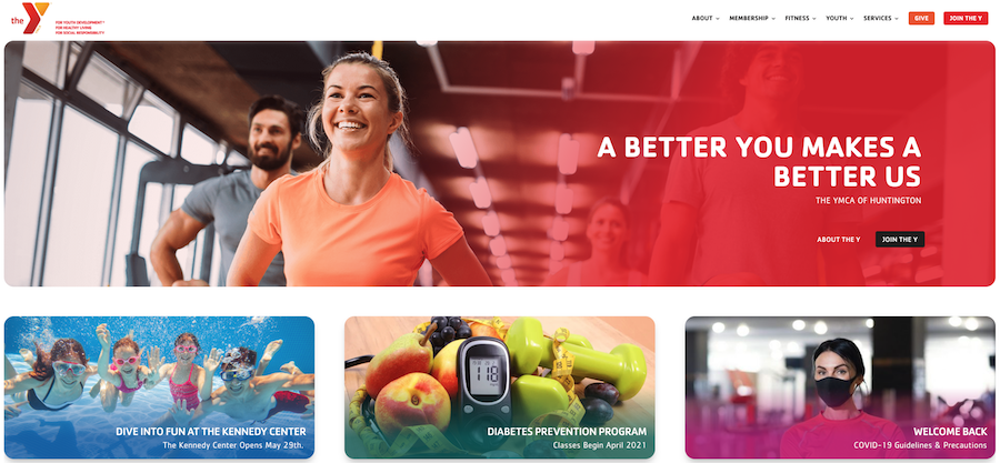
Huntington YMCA’s primary goal is to strengthen communities by focusing on youth development, healthy living, and social responsibility.
The content uses the entire width of the page and includes rounded images and bright colors. You’ll also notice a sticky navigation bar that stays put at the top, even when you scroll down the page.
The page is easy to navigate and fast to download.
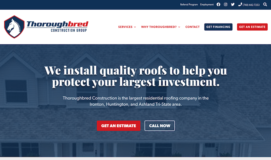
Does your roof need a renewal?
If you live anywhere near the Ironton, Huntington, and Ashland Tri-State area, then consider Thoroughbred Construction Group for the job.
Right after you have loaded the home page, you clearly see what the company is all about and what they promise to you. Right after this text, you notice the call to action (CTA) buttons, so you can get an estimate of the repair or call them.
Thoroughbred uses sticky navigation on their site, making navigation between different parts of the website simple.
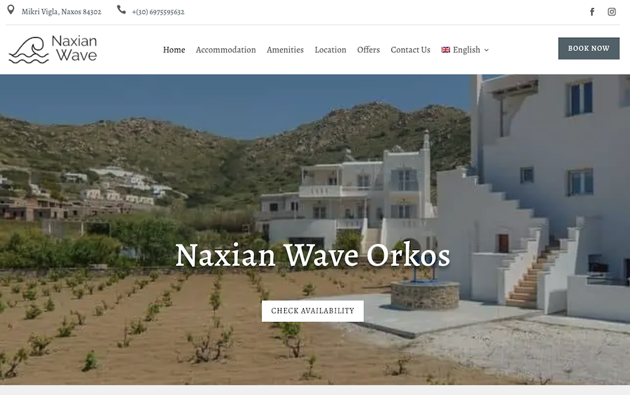
Naxian Wave Orkos offers accommodation in Drymalia, which is part of the Greek island Naxos.
The main menu sits at the top of the page. You can find a Book Now button to the left of the navigation, which takes you to their reservation system. There, you can view their apartments in more detail.
The overall theme of the pages is white, just like the buildings located on Drymalia. The pages show big images of the available rooms. You can find the contact information and customer testimonials, too.
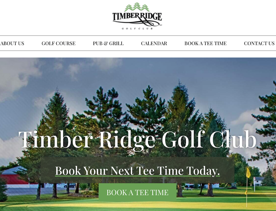
Would you like to play golf?
If you are in the Rochester area in New York, you could head out to the Timber Ridge Golf Club.
The home page opens with a full-width picture of one of the holes in the course. You can click the Book a Tee Time button in the middle of the page to reserve your spot on the golf course.
The home page also features helpful information regarding the course, including the contact information, customer reviews, and an introduction to their facilities.
When you scroll down any of the pages, you’ll notice smooth animation effects on images.
At the end of the page, you find a footer area. It includes the navigation, combined with the contact information and links to social media profiles.
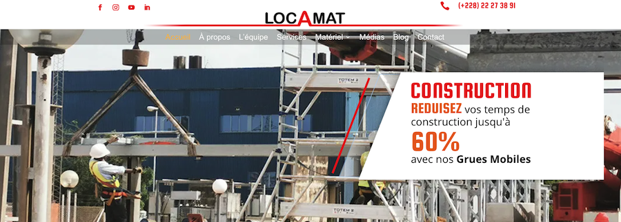
LOCAMAT is a Togo-based company in West Africa. It offers heavy lifting, handling, and truck services in Togo, Burkina Faso, Benin, and Ghana.
The front page of the website contains a full-width animation, where the company shows its services. On the home page, you can also read more about the types of services they offer.
When you scroll down the page, you’ll find customer testimonials and information on contacting them. You can quickly jump from page to page by using the sticky navigation at the top.
In the footer area, you can join their email list by entering your name and email.
The company’s brand color is red, and this same color is dominant on their pages, too.
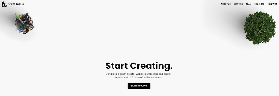
When you enter the White Gorilla, you see a page-wide image of a desktop. In the middle of this area, you learn that the company creates websites, web apps, and digital experiences. Next, you’ll notice a black button that says “Start a Project.”
White Gorilla’s website is an example of a one-page website. The header area contains sticky navigation. Clicking on any of the items on the menu makes you jump to a specific part of the page.
The overall color scheme is black and white. The exception to this rule is the works area, which features their previous projects with full-color images.
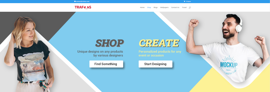
Trafoos is an online store that sells unique designs on products like t-shirts, mugs, or posters. If you don’t find the design you are looking for, you can also create your own.
You can start shopping or creating your custom products by clicking on the appropriate buttons at the top of the page. When you scroll down the home page a bit, you’ll also find all their shopping categories and featured products.
In the footer area, there is an opt-in form. When you join the email list, you’ll receive exclusive designs and discounts.
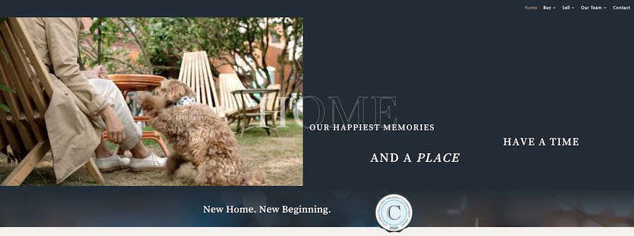
This website presents the realtors named the Langhirt Crew. They are real estate agents located in Columbus, Ohio.
The home page displays a looping video, showing all the various happy experiences and memories a home can have.
When you scroll down the page a bit, you find an introduction to their team, followed by the featured property and client testimonials.
You can find the company’s contact information in the footer and links to social media profiles, too.
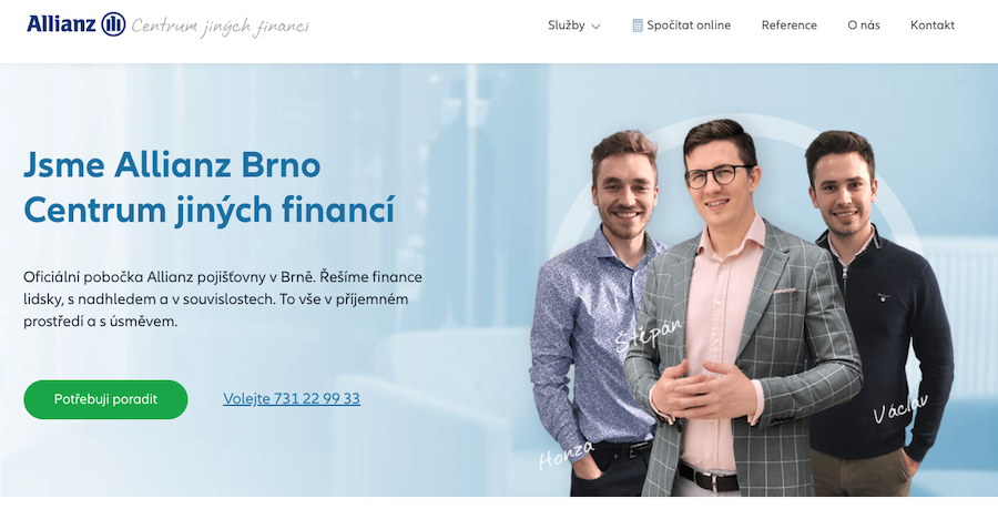
Allianz is a global financial services provider. Allianz Brno is an official branch of the Allianz corporation located in the Czech Republic.
The website uses controlled and well-balanced colors to represent its brand. On the homepage, you see a picture of their three local agents working in the branch. This picture adds more trust towards the company.
A green CTA button is located at the top of the home page, asking you to contact the agency. Next to the CTA, you can also find a phone number if you’d like to call them instead.
The home page gives you all the essential information about the company and the services they offer. The footer area provides the contact information, with a map on how to reach them in Brno.
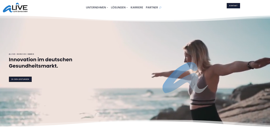
Alive offers various services, like IT or employee-related, for the German health care market.
The home page includes a full-width video background, with a CTA button taking you to the services section.
When you scroll down the page, you’ll see the images and other elements animate a bit. You’ll also learn more about the company.
The top navigation takes you to various parts of the website, including the company information, the list of solutions they have developed, and career opportunities.
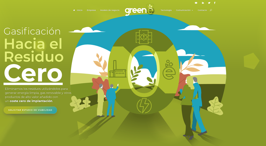
Greene is a company from Spain, and their core idea is to get rid of waste and turn it into green energy.
Since ecological values are at the heart of the business, the website colors reflect these matters. Green color, combined with white and dark grey/black, makes their website effective.
The main navigation sits at the top of the page. When you scroll down, you will learn more about the waste removal processes with appropriate CTA buttons. You can also find the latest blog posts curated on the home page.
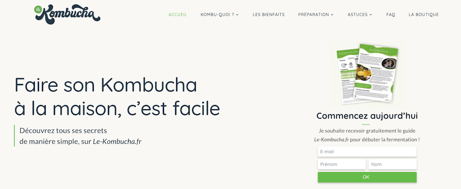
Le Kombucha is a website dedicated to making kombucha at home.
Kombucha is a sweet-and-sour drink made of tea. Some say this popular drink is healthy for you, although the science hasn’t proved the health factors.
When you enter Le Kombucha, you’ll notice a very pleasantly designed website, with a big email opt-in form above the fold.
Keep scrolling down the page, and you’ll learn all the benefits the drink has to offer. And while you are scrolling, notice the subtle navigation taking place on-page elements.
If you click on the navigation items at the top, you land on a different page on the site. You would expect the design to stay the same on sub-pages, but this is not the case. In fact, the sub-page layout is quite different from the homepage.
Finally, you can also find an online shop where you can purchase the goods required for making kombucha at home.
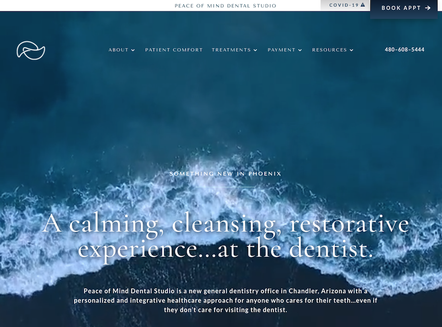
Peace of Mind Dental Studio promises to bring a different experience to dental care. Typically, going to a dentist can be a nervous experience, but they want it to be “calming, cleansing, and restorative” instead.
When you land on the website, you notice a big video background of waves at the beach. Hopefully, these waves will have a calming effect on you. Later down the page, you learn more about the dental clinic and the experience they hope to give.
At the top, there is a sticky CTA button, asking you to book an appointment with them. And when you scroll to the bottom of the page, you find a big footer area with their opening hours and links to other parts of the website.
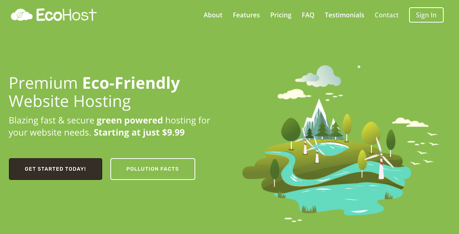
EcoHost offers green hosting solutions for individuals and small businesses. According to them, they use servers that are 100% powered by wind energy. They also plant a tree for every month your website is hosted with them.
The site is a one-page website. The site uses sticky navigation, which makes moving around on the page easy.
You will find CTA buttons above the fold. The black-colored one asks you to get started right away (with the hosting plans), while the other gives you pollution facts. The latter button makes sense; after all, this an eco-friendly web host.
At the bottom, you find the FAQ, followed by the black footer area, which includes a link to the pricing section and an opt-in form.
As you would expect, the green color is dominant on this page. Combined with other colors, you have a site that is pleasing to the eye.
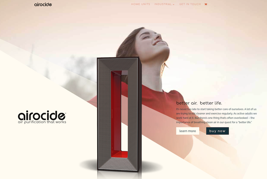
Airocide is an air purification system for homes.
On the home page, you have two buttons. When you click either of them, you can learn more about the product or purchase it.
Loading the page or clicking the inline links activate subtle animation on various page elements. You will also notice that the website uses big, page-wide graphical elements on its pages.
You can jump back to the top of the page with the upward-pointing arrow on the right side of the page. You can also find a Feedback link on the right side, where you can rate your website experience.
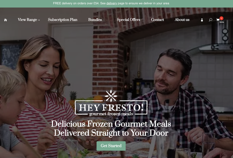
Feeling hungry but don’t want to go to the restaurant?
If you live in the UK, then Hey Fresto! has got you covered. The idea behind the service is to deliver delicious meals to your doorstep.
The home page opens with a full-width image of a family eating a meal. There is also a Get Started button in the middle, so you can start exploring what Hey Fresto! has to offer.
The homepage is full of delicious images that the service delivers to you. You can also add the best seller foods to your shopping basket right on the front page.
At the end of the home page, you can find an opt-in form. If you join their email list, they give you 20% off your first delivery.
With the sticky navigation at the top, you’ll never get lost on the website. Big colorful images, controlled animation on elements while you scroll through, and fast-loading pages give an excellent impression of this food delivery service.
16 Examples of Awesome Websites Built with Divi: The Conclusion
In this post, I introduced 16 websites that use Divi. You were able to find a wide selection of sites to see how powerful Divi is.
If you were impressed by these websites like I was, and you’d like to give Divi a try, we have something special for you.
As a WP Kube reader, we have a special deal with the Elegant Themes, the developer behind the Divi theme.
When you use our coupon code, you get -20% off an Elegant Themes membership. This membership provides you access to Divi and the rest of the goodies that Elegant Themes offer.
So wait no longer and get access to Divi at a discounted price!